Android Button 按钮
Button 用于创建一个按钮,具有正常状态和点击状态,Button 继承自 TextView ,所以可以 TextView 的那些属性
实际开发中,无非是对按钮的几个状态做相应的操作,比如:按钮按下的时候 用一种颜色,弹起又一种颜色,或者按钮不可用的时候一种颜色这样
基本的按钮
我们可以直接使用 XML 语法创建一个 Button
<Button
    android:text="Login"
    android:layout_width="wrap_content"
    android:layout_height="wrap_content" />
我们写一个范例创建一个按钮 <Button>
-
创建一个 空的 Android 项目
cn.twle.android.Button -
修改
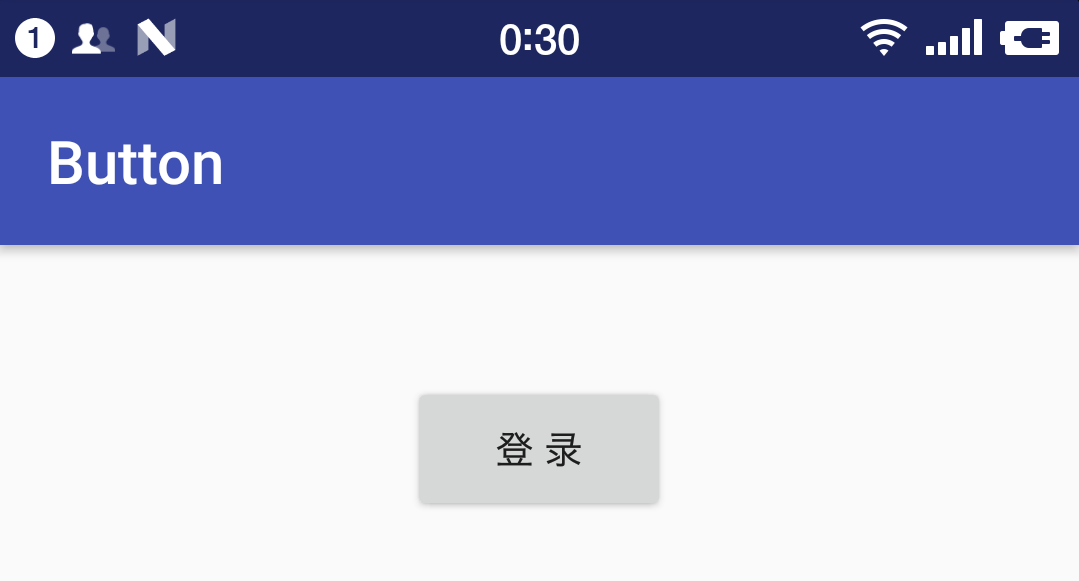
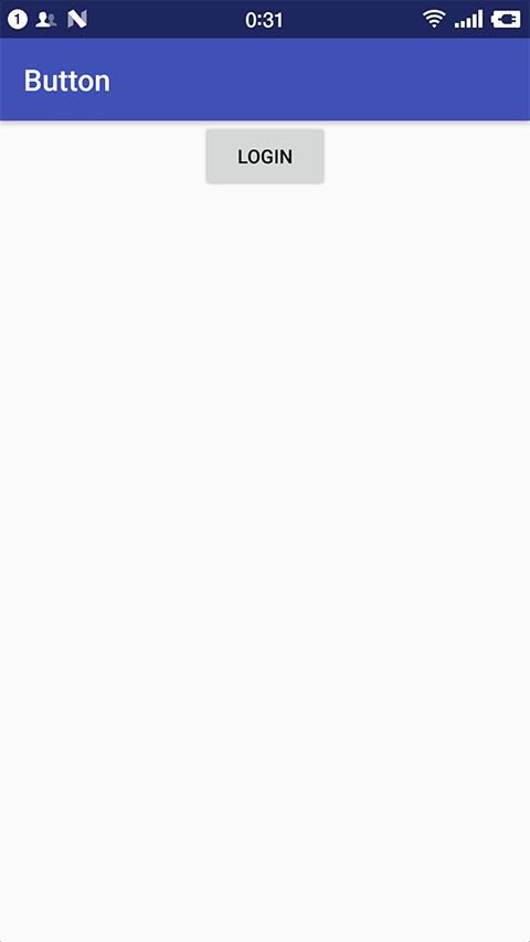
activity_main.xml添加一个<Button><?xml version="1.0" encoding="utf-8" ?> <LinearLayout xmlns:android="http://schemas.android.com/apk/res/android" android:layout_width="match_parent" android:layout_height="match_parent" android:gravity="center_horizontal" android:orientation="vertical" > <Button android:text="Login" android:layout_width="wrap_content" android:layout_height="wrap_content" /> </LinearLayout>
运行 demo 效果如下
StateListDrawable
StateListDrawable 是 Drawable 资源的一种,可以根据不同的状态,设置不同的图片效果,关键节点 <selector>
我们可以将 Button 的 android:background 属性设置为该 drawable 资源即可轻松实现按下
按钮时不同的按钮颜色或背景
下表列出了可以设置的属性
| 属性 | 说明 |
|---|---|
| drawable | 引用的 Drawable 位图,可以把它放到最前面,就表示组件的正常状态 |
| android:state_focused | 是否获得焦点 |
| android:state_window_focused | 是否获得窗口焦点 |
| android:state_enabled | 控件是否可用 |
| android:state_checkable | 控件可否被勾选,例如,checkbox |
| android:state_checked | 控件是否被勾选 |
| android:state_selected | 控件是否被选择,针对有滚轮的情况 |
| android:state_pressed | 控件是否被按下 |
| android:state_active | 控件是否处于活动状态,例如,SlidingTab |
| android:state_single | 控件包含多个子控件时,确定是否只显示一个子控件 |
| android:state_first | 控件包含多个子控件时,确定第一个子控件是否处于显示状态 |
| android:state_middle | 控件包含多个子控件时,确定中间一个子控件是否处于显示状态 |
| android:state_last | 控件包含多个子控件时,确定最后一个子控件是否处于显示状态 |
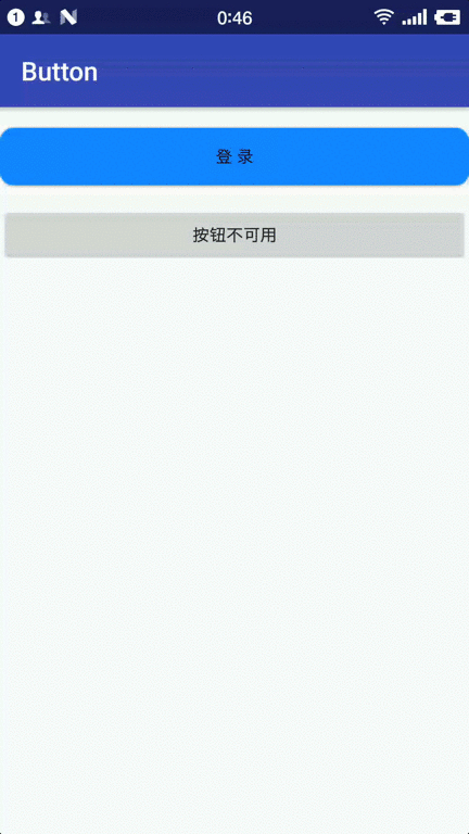
按钮的按下效果
我们写一个范例来演示下按钮正常的状态 、禁用状态和按下的状态
-
创建一个 空的 Android 项目
cn.twle.android.Button -
下载解压 /static/i/android/btn_stated.zip,并把所有的图片拖到
res/drawable目录下 -
在
res/drawable目录下新建一个按钮状态的资源文件btn_bg.xml<?xml version="1.0" encoding="utf-8"?> <selector xmlns:android="http://schemas.android.com/apk/res/android"> <item android:state_pressed="true" android:drawable="@drawable/btn_pressed"/> <item android:state_enabled="false" android:drawable="@drawable/btn_disabled"/> <item android:drawable="@drawable/btn_normal"/> </selector>
-
修改
activity_main.xml添加两个按钮<?xml version="1.0" encoding="utf-8" ?> <LinearLayout xmlns:android="http://schemas.android.com/apk/res/android" android:layout_width="match_parent" android:layout_height="match_parent" android:gravity="center_horizontal" android:orientation="vertical" > <Button android:layout_marginTop="16dp" android:id="@+id/btnOne" android:layout_width="match_parent" android:layout_height="44dp" android:background="@drawable/btn_bg" android:text="登 录"/> <Button android:layout_marginTop="16dp" android:id="@+id/btnTwo" android:layout_width="match_parent" android:layout_height="44dp" android:text="按钮不可用"/> </LinearLayout>
-
修改
MainActivity.java给按钮添加点击事件package cn.twle.android.button; import android.os.Bundle; import android.support.v7.app.AppCompatActivity; import android.view.View; import android.widget.Button; public class MainActivity extends AppCompatActivity { private Button btnOne,btnTwo; @Override protected void onCreate(Bundle savedInstanceState) { super.onCreate(savedInstanceState); setContentView(R.layout.activity_main); btnOne = (Button) findViewById(R.id.btnOne); btnTwo = (Button) findViewById(R.id.btnTwo); btnTwo.setOnClickListener(new View.OnClickListener() { @Override public void onClick(View v) { if(btnTwo.getText().toString().equals("按钮不可用")){ btnOne.setEnabled(false); btnTwo.setText("按钮可用"); }else{ btnOne.setEnabled(true); btnTwo.setText("按钮不可用"); } } }); } }
运行以上范例,输出结果如下
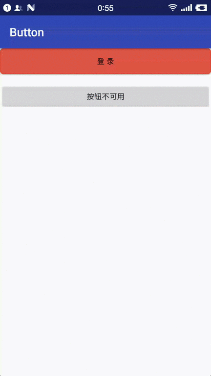
使用颜色值绘制圆角按钮
使用图片作为按钮的背景太坑了,还要设置为 .9.png 格式,其实,我们还可以使用颜色值来绘制按钮的背景
使用颜色值来绘制按钮的背景需要使用 drawable 资源 ShapeDrawable
因为后面我们会详细讲解 ShapeDrawable ,这里我们会用就好了
-
复用上面的 demo
-
修改 color.xml 添加几个颜色值
<?xml version="1.0" encoding="utf-8"?>
<resources>

    <color name="colorPrimary">#3F51B5</color>
    <color name="colorPrimaryDark">#303f9f</color>
    <color name="colorAccent">#FF4081</color>

    <color name="bbutton_danger_pressed">#ffd2322d</color>
    <color name="bbutton_danger_edge">#ffd43f3a</color>
    <color name="bbutton_danger_disabled">#a5d9534f</color>
    <color name="bbutton_danger_disabled_edge">#a5d43f3a</color>
    <color name="bbutton_danger">#ffd9534f</color>
    <color name="text_font_white">#FFFFFF</color>
</resources>
-
在
res/drawable目录下创建drawable文件 dimens.xml<?xml version="1.0" encoding="utf-8"?> <resources> <dimen name="bbuton_rounded_corner_radius">5dp</dimen> </resources>
-
在
res/drawable目录下创建drawable文件 button_rounded.xml<?xml version="1.0" encoding="utf-8"?> <selector xmlns:android="http://schemas.android.com/apk/res/android"> <item android:state_pressed="true"><shape> <solid android:color="@color/bbutton_danger_pressed" /> <stroke android:width="1dp" android:color="@color/bbutton_danger_edge" /> <corners android:radius="@dimen/bbuton_rounded_corner_radius"/> </shape></item> <item android:state_enabled="false"><shape> <solid android:color="@color/bbutton_danger_disabled" /> <stroke android:width="1dp" android:color="@color/bbutton_danger_disabled_edge" /> <corners android:radius="@dimen/bbuton_rounded_corner_radius"/> </shape></item> <item><shape> <solid android:color="@color/bbutton_danger" /> <stroke android:width="1dp" android:color="@color/bbutton_danger_edge" /> <corners android:radius="@dimen/bbuton_rounded_corner_radius"/> </shape></item> </selector>
-
修改
activity_main.xml将背景指向 buton_rounded<?xml version="1.0" encoding="utf-8" ?> <LinearLayout xmlns:android="http://schemas.android.com/apk/res/android" android:layout_width="match_parent" android:layout_height="match_parent" android:gravity="center_horizontal" android:orientation="vertical" > <Button android:id="@+id/btnOne" android:layout_width="match_parent" android:layout_height="44dp" android:background="@drawable/button_rounded" android:text="登 录"/> <Button android:layout_marginTop="16dp" android:id="@+id/btnTwo" android:layout_width="match_parent" android:layout_height="44dp" android:text="按钮不可用"/> </LinearLayout>