Android CheckBox 复选框
Android CheckBox (复选框) 继承自 Button ,可以说是只有两种状态的按钮 (选中或未选中状态)
可以把多个 CheckBox 放在一起实现同时选中多项,但是,记住,它们之间没有任何关系,一个的选中并不会影响另一个选中或者不选中
CheckBox (复选框)
CheckBox 除了从 Button 继承而来的属性外,没有自己的属性,但从 CompoundButton 继承了一个属性 android:checked 用于表示是否选中
| 属性 | 说明 |
|---|---|
| android:checked | 设置或者获取 CheckBox 是否选中 |
所以,创建一个 CheckBox 很简单
<CheckBox
    android:id="@+id/android"
    android:layout_width="wrap_content"
    android:layout_height="wrap_content"
    android:text="Android"
    android:checked="true" />
我们写一个 demo 来创建几个 CheckBox
-
创建一个 空的 Android 项目
cn.twle.android.CheckBox -
修改
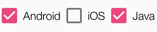
activity_main.xml添加几个CheckBox<?xml version="1.0" encoding="utf-8" ?> <LinearLayout xmlns:android="http://schemas.android.com/apk/res/android" android:layout_width="match_parent" android:layout_height="match_parent" android:padding="8dp" android:orientation="horizontal" > <CheckBox android:id="@+id/android" android:text="Android" android:checked="true" android:layout_width="wrap_content" android:layout_height="wrap_content" /> <CheckBox android:id="@+id/ios" android:text="iOS" android:layout_width="wrap_content" android:layout_height="wrap_content" /> <CheckBox android:id="@+id/java" android:text="Java" android:checked="true" android:layout_width="wrap_content" android:layout_height="wrap_content" /> </LinearLayout>
运行范例,显示如下

获得选中的 CheckBox 的值
CheckBox 提供了几个方法和事件用于设置或者获取自身是否选中状态
| 方法 | 说明 |
|---|---|
| isChecked() | 判断自身是否选中 |
| setChecked(boolean checked) | 设置自身是否选中状态 |
| 事件 | 说明 |
|---|---|
| OnCheckedChangeListener | 选中状态改变监听器,当自身选中状态变化时会触发这个事件 |
所以,如果要获得选中的 CheckBox,有两种方式
- 为每个
CheckBox添加事件:setOnCheckedChangeListener - 弄一个按钮,在点击后,对每个 CheckBox 进行判断
isChecked()
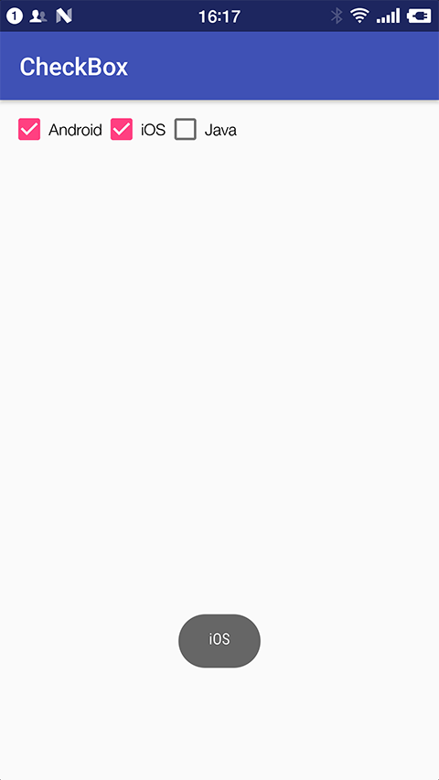
这里我们使用第一种方法来演示如何获得选中的 CheckBox
-
复用上面的 demo
-
修改
MainActivity.java为每个CheckBox添加事件OnCheckedChangeListenerpackage cn.twle.android.checkbox; import android.support.v7.app.AppCompatActivity; import android.os.Bundle; import android.widget.CompoundButton; import android.widget.CheckBox; import android.widget.Toast; public class MainActivity extends AppCompatActivity implements CompoundButton.OnCheckedChangeListener{ private CheckBox java; private CheckBox android; private CheckBox ios; @Override protected void onCreate(Bundle savedInstanceState) { super.onCreate(savedInstanceState); setContentView(R.layout.activity_main); java = (CheckBox) findViewById(R.id.java); android = (CheckBox) findViewById(R.id.android); ios = (CheckBox) findViewById(R.id.ios); java.setOnCheckedChangeListener(this); android.setOnCheckedChangeListener(this); ios.setOnCheckedChangeListener(this); } @Override public void onCheckedChanged(CompoundButton compoundButton, boolean b) { if(compoundButton.isChecked()) Toast.makeText(this,compoundButton.getText().toString(),Toast.LENGTH_SHORT).show(); } }
自定义点击效果
有时候我们需要实现自己的选中和非选中效果,比如 √ 和 √
这时候只要用 CheckBox 改改就好了,很简单的,下面我们就来定制一个
-
创建一个 空的 Android 项目
cn.twle.android.CheckBox -
下载 /static/i/android/checkbox.zip 并将里面的图片拖到
res/drawable目录下 -
在
res/drawable目录下新建 selctor 资源文件language_checkbox.xml,用于设置选中与没选中时的切换图片<?xml version="1.0" encoding="utf-8"?> <selector xmlns:android="http://schemas.android.com/apk/res/android"> <item android:state_enabled="true" android:state_checked="true" android:drawable="@drawable/checkbox_checked"/> <item android:state_enabled="true" android:state_checked="false" android:drawable="@drawable/checkbox_unchecked" /> </selector>
-
修改
activity_main.xml添加几个RadioButton,通过属性android:button="@drawable/language_checkbox"<?xml version="1.0" encoding="utf-8" ?> <LinearLayout xmlns:android="http://schemas.android.com/apk/res/android" android:layout_width="match_parent" android:layout_height="match_parent" android:padding="8dp" android:orientation="horizontal" > <CheckBox android:id="@+id/android" android:text="Android" android:checked="true" android:button="@drawable/language_checkbox" android:layout_width="wrap_content" android:layout_height="wrap_content" /> <CheckBox android:id="@+id/ios" android:text="iOS" android:checked="true" android:button="@drawable/language_checkbox" android:layout_width="wrap_content" android:layout_height="wrap_content" /> <CheckBox android:id="@+id/java" android:text="Java" android:checked="true" android:button="@drawable/language_checkbox" android:layout_width="wrap_content" android:layout_height="wrap_content" /> </LinearLayout>
改变文字与选择框的相对位置
要控制选择框的位置,只要
- 在 XML 中设置
android:button="@null" - 在 XML 中设置
android:drawableTop="@android:drawable/btn_radio"
可以把 drawablexxx 替换想要控制的方向
修改文字与选择框的距离
如果需要调节文字与选择框之间的距离,有以下两种方法
-
在 XML 代码中使用
android:paddingxxx = "xxx"来控制距离 -
使用 Java 代码动态计算 paddingLeft
rb.setButtonDrawable(R.drawable.rad_btn_selctor);
int rb_paddingLeft = getResources().getDrawable(R.mipmap.ic_checkbox_checked).getIntrinsicWidth()+5;
rb.setPadding(rb_paddingLeft, 0, 0, 0);